Designing Credibility: The Brand Identity Journey
for Dinesh Consulting

The Challenge
Create a distinctive brand that unites Dinesh Consulting’s precision engineering and visionary architecture-fusing logic and creativity into a timeless design adaptable across digital, print, and on-site applications.
Concept: Architecture as Identity
The brand identity draws inspiration from the towering strength of tall buildings, reflecting Dinesh Consulting’s expertise in structural design. It incorporates clean, precise lines reminiscent of architectural blueprints, symbolizing careful planning and detail.
Central to the design is the letter “D,” representing Dinesh Consulting, crafted to create a strong visual cue that enhances brand recognition and recall.
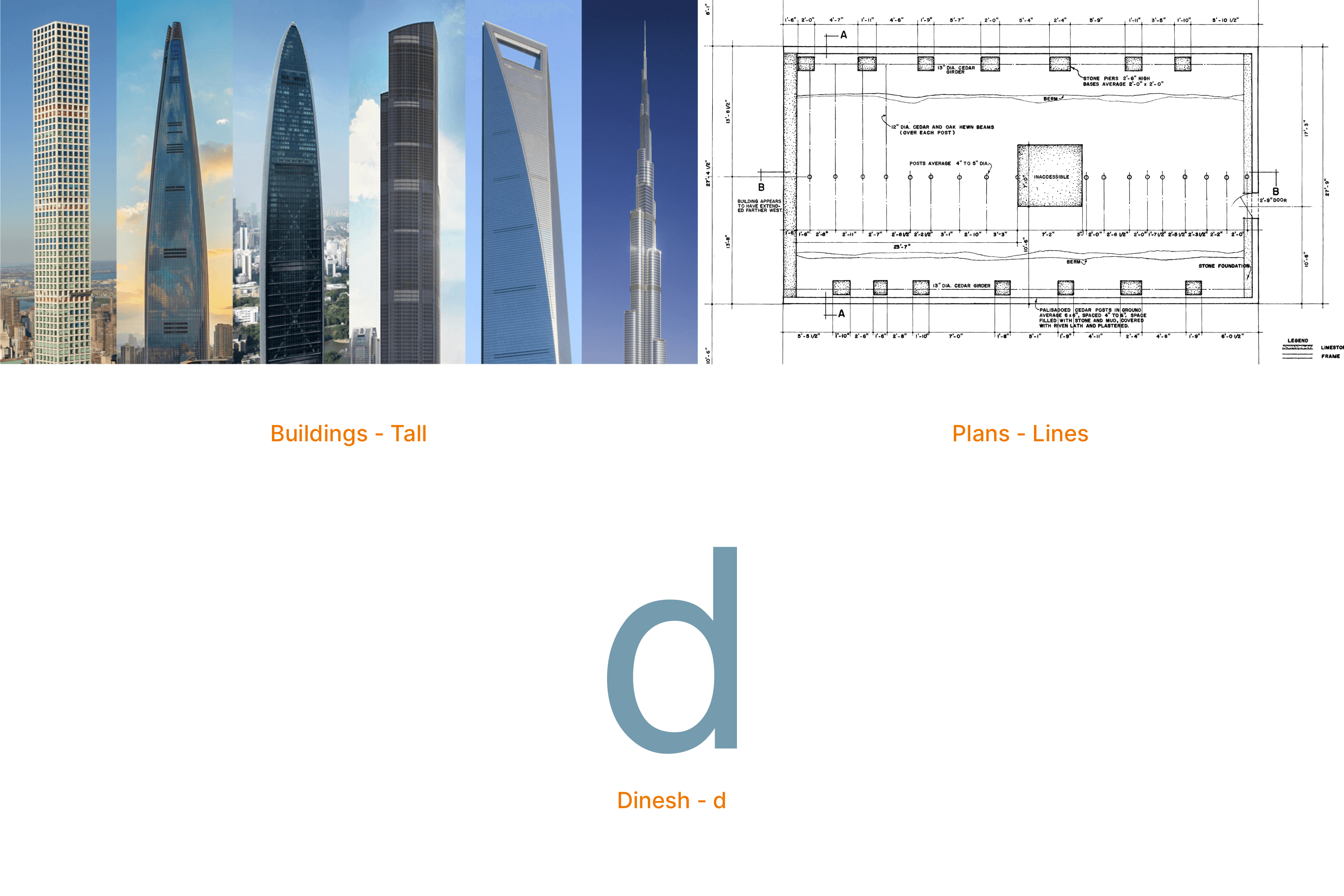
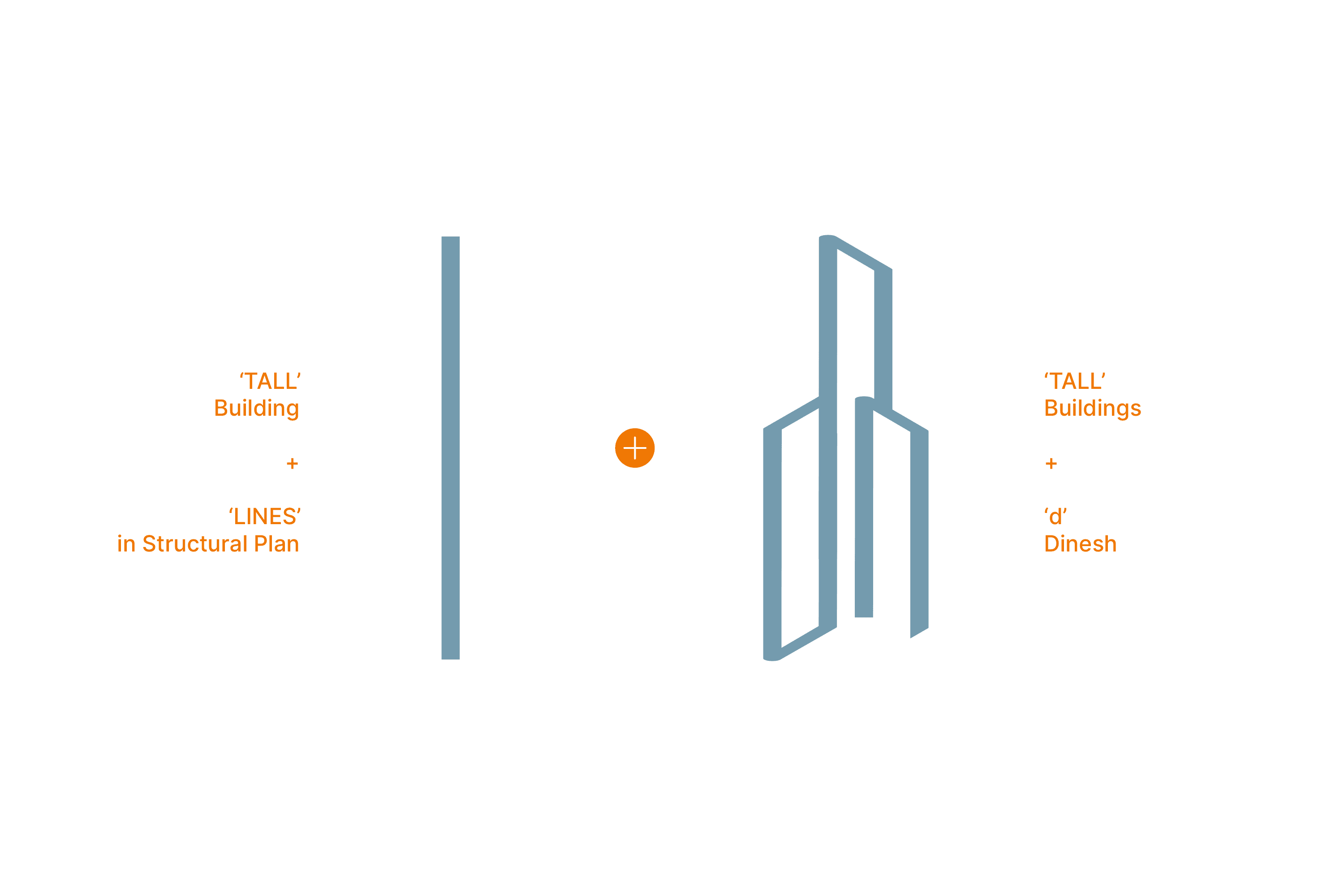
Forging a Brand from Lines & Legacy
The design merges blueprint lines and the form of tall buildings into the letter “D,” symbolizing Dinesh Consulting’s fusion of architectural precision and identity.

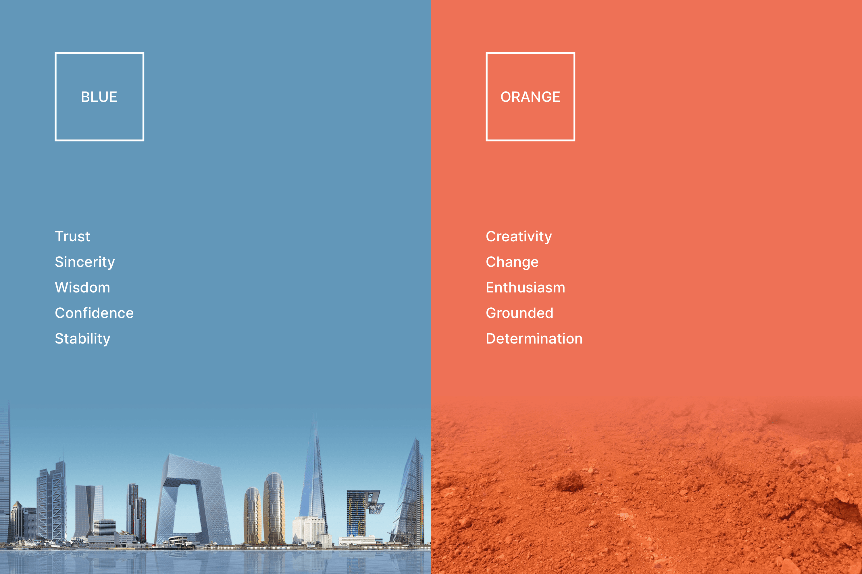
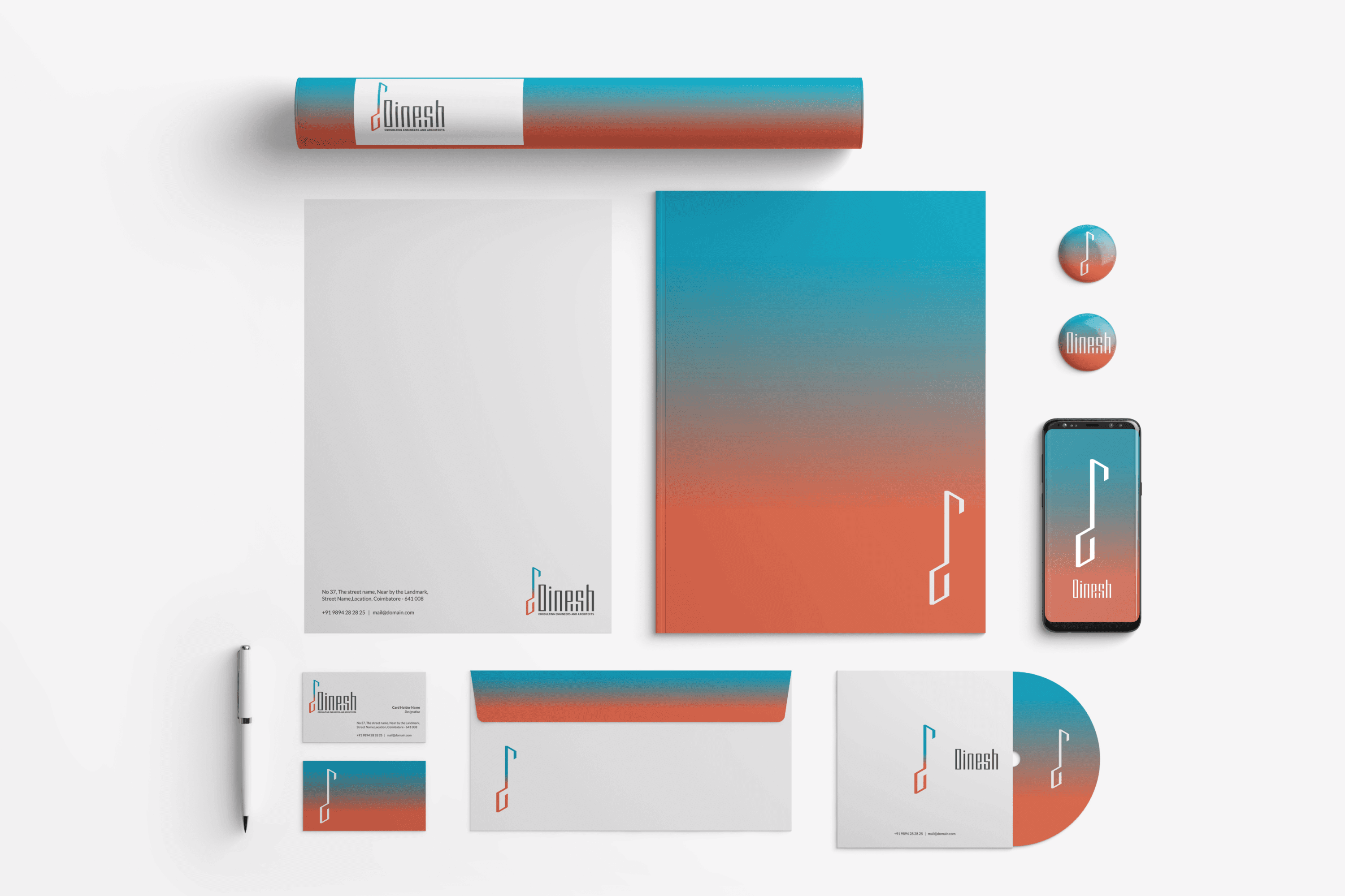
The Meaning Behind the Colors
The colors are inspired by the company’s core values: blue represents the sky, symbolizing the tall, soaring buildings and architectural vision, while a warm earthy orange reflects the company’s grounded empathy and deep understanding of its clients.


Typography Built Like Skyscrapers
Inspired by the design concept, we crafted custom typography for “Dinesh” where each letter mimics the form of tall, closely clustered buildings—creating a powerful visual that embodies the strength and unity of architectural structures.

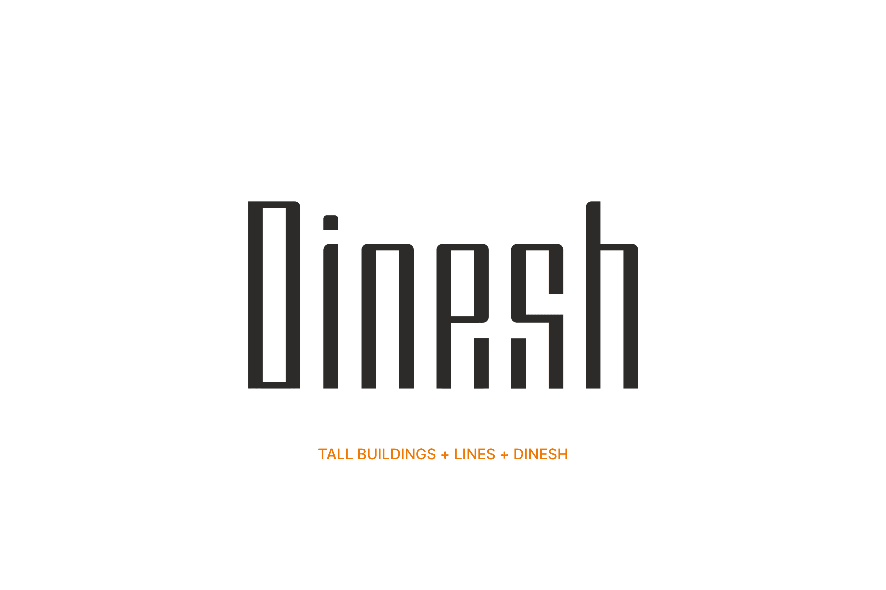

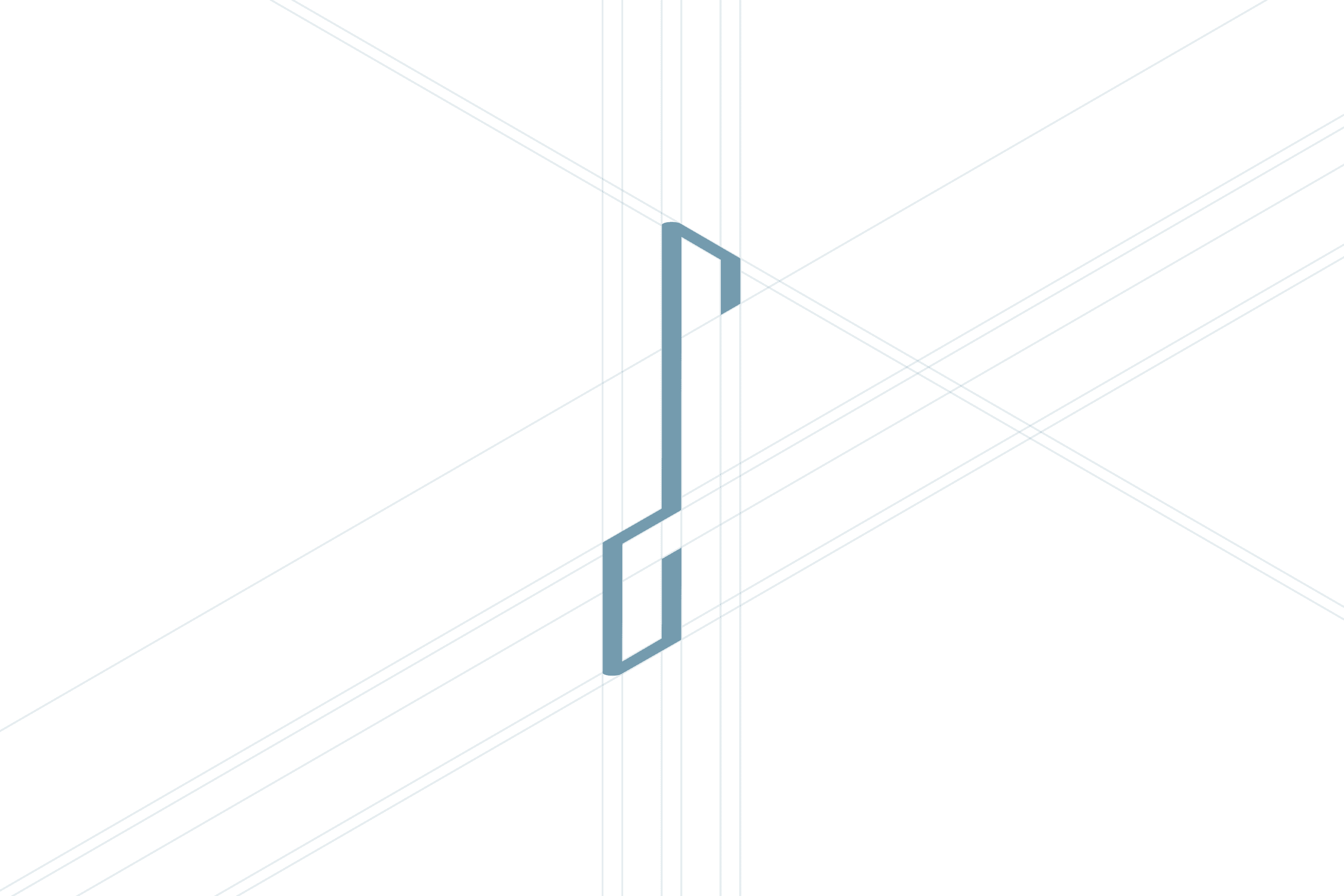
Final Logo Design


From Challenge to Clarity
This project was a challenging and rewarding journey that deepened my understanding of architecture and structural design. Navigating a saturated market made finding a unique brand direction difficult, but through rigorous research, multiple iterations, and unwavering focus, I crafted a distinctive identity that truly reflects Dinesh Consulting’s vision and expertise. The final result is a bold, timeless brand I’m proud to have brought to life.

