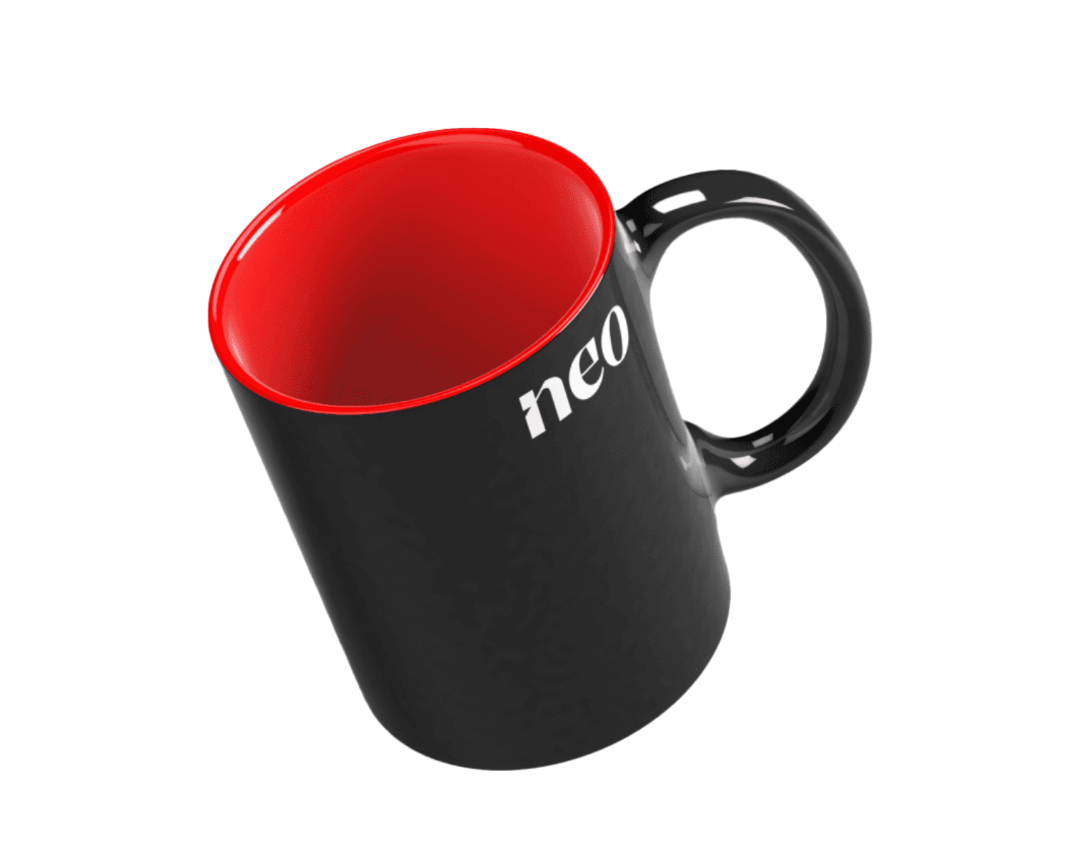
Brand Identity for a Fast-Rising EdTech Startup
Brand & UI/Ux Design
The Challenge
Discovery: Finding Neo's Spirit
During a vibrant brand discovery session with Neo's founder and core team, seven remarkable characteristics emerged that define this unique brand:
- Wisdom
- Power
- Boldness
- Respect
- Intelligence
- Knowledge
- Zen-like calm
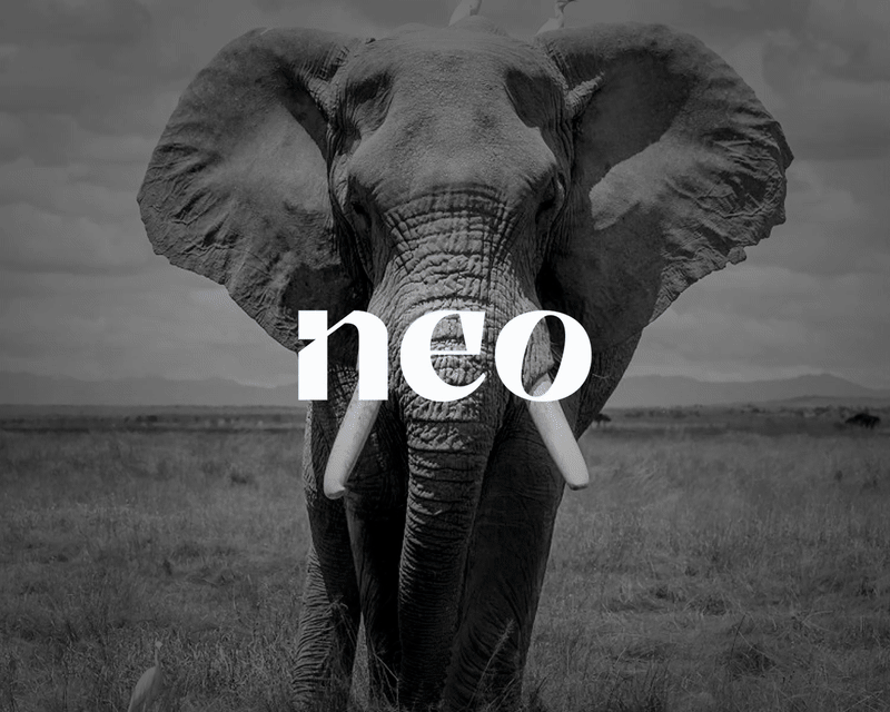
This journey explored how Neo would connect and communicate in everyday interactions. The pivotal moment came when searching for a spirit animal that perfectly embodied these qualities.
The exploration led to the elephant—a magnificent symbol of intelligence, strength, and education that resonates deeply with Neo's essence. Already treasured in the cultural mindset of the audience, the elephant stands as a trusted companion for learning and growth.
This powerful symbol formed the foundation of Neo's visual language, tone, and distinctive personality, creating an immediate emotional connection with everyone who encounters the brand.
Typography with Purpose
The typography selected reflects technology, education, and intelligence -clean, modern, and smart to align with Neo's core values.
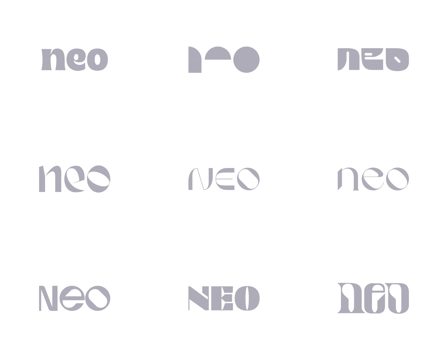
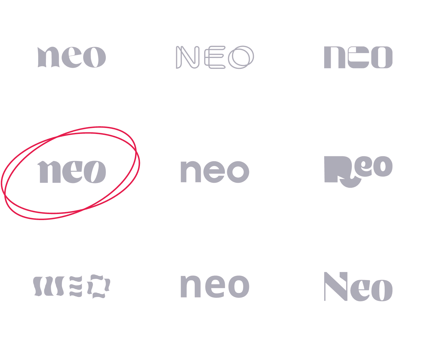
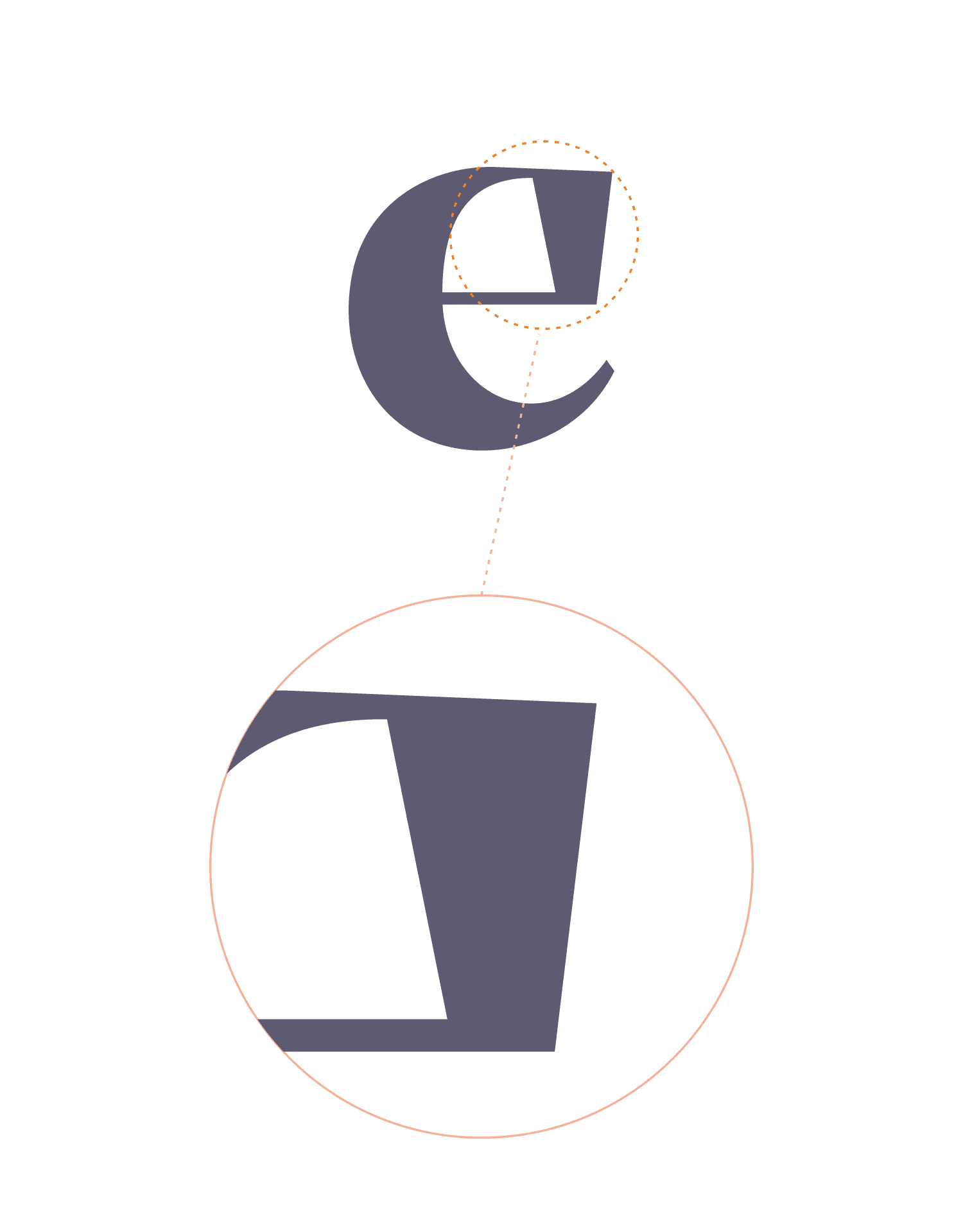
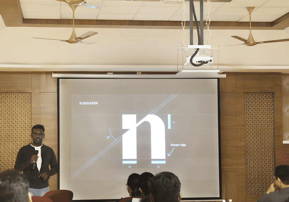
Special attention went to incorporating the letter "i" in a way that subtly reflects intelligence without compromising legibility. Designed to stand strong as an individual character, it echoes clarity and purpose across the identity.

Equal care was given to the characters "e" and "o"—shaping them to feel modern, balanced, and harmonious. Together, they form a cohesive trio that embodies Neo's intelligent, tech-forward personality.
These elements work in perfect harmony - visually balanced, clean, and perfectly aligned with each other.


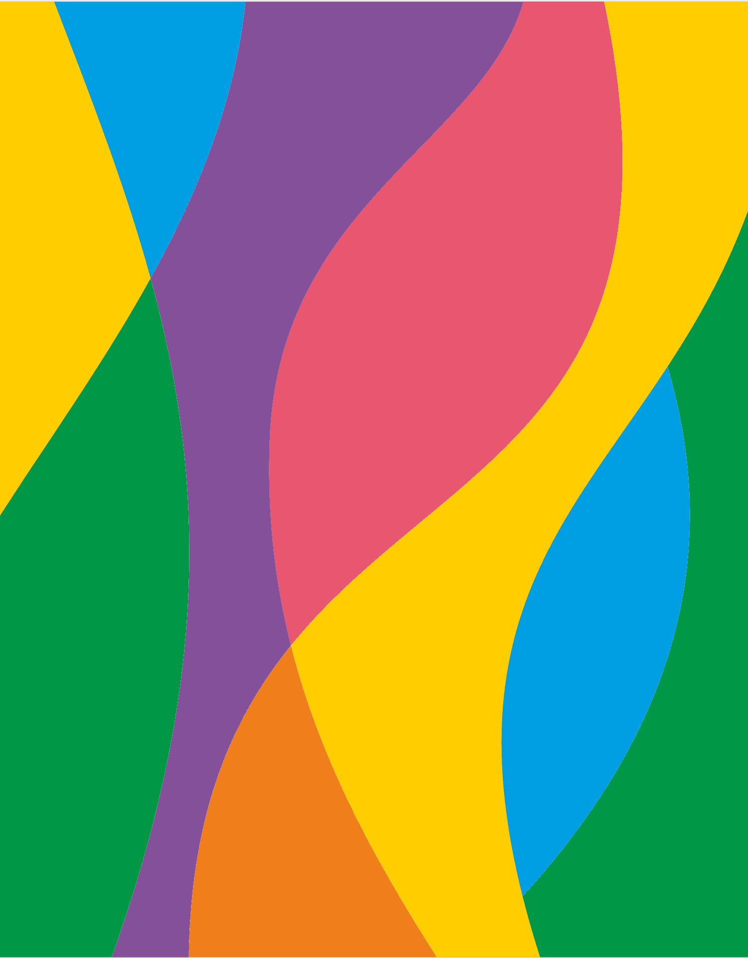
Colors That Connect
The color palette emerged from the everyday world of the target audience. Looking around at their environment filled with stationery - notebooks, sticky notes, highlighters, folders - these aren't just objects but part of a daily rhythm.
That's where the colors came from—pulled straight from that familiar world. The palette feels warm, reliable, and authentic. It speaks their language, creating an instant connection that feels quietly powerful and genuinely relatable.

Building for Growth
With the logo thoughtfully crafted, attention turned to ensuring it would scale seamlessly across products and sub-brands. This led to a flexible design system—built to be cohesive, future-proof, and ready to grow with Neo's expanding product ecosystem.


For interiors, creatives, and brand outreach, three unique patterns were developed to bring the identity to life.


After exploring all possibilities, Pattern two emerged as the clear winner—striking the perfect balance of energy, clarity, and brand alignment. The final results reflect this thoughtful choice.


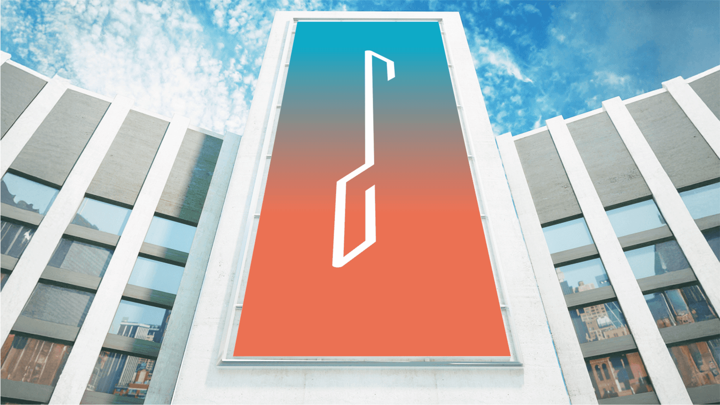
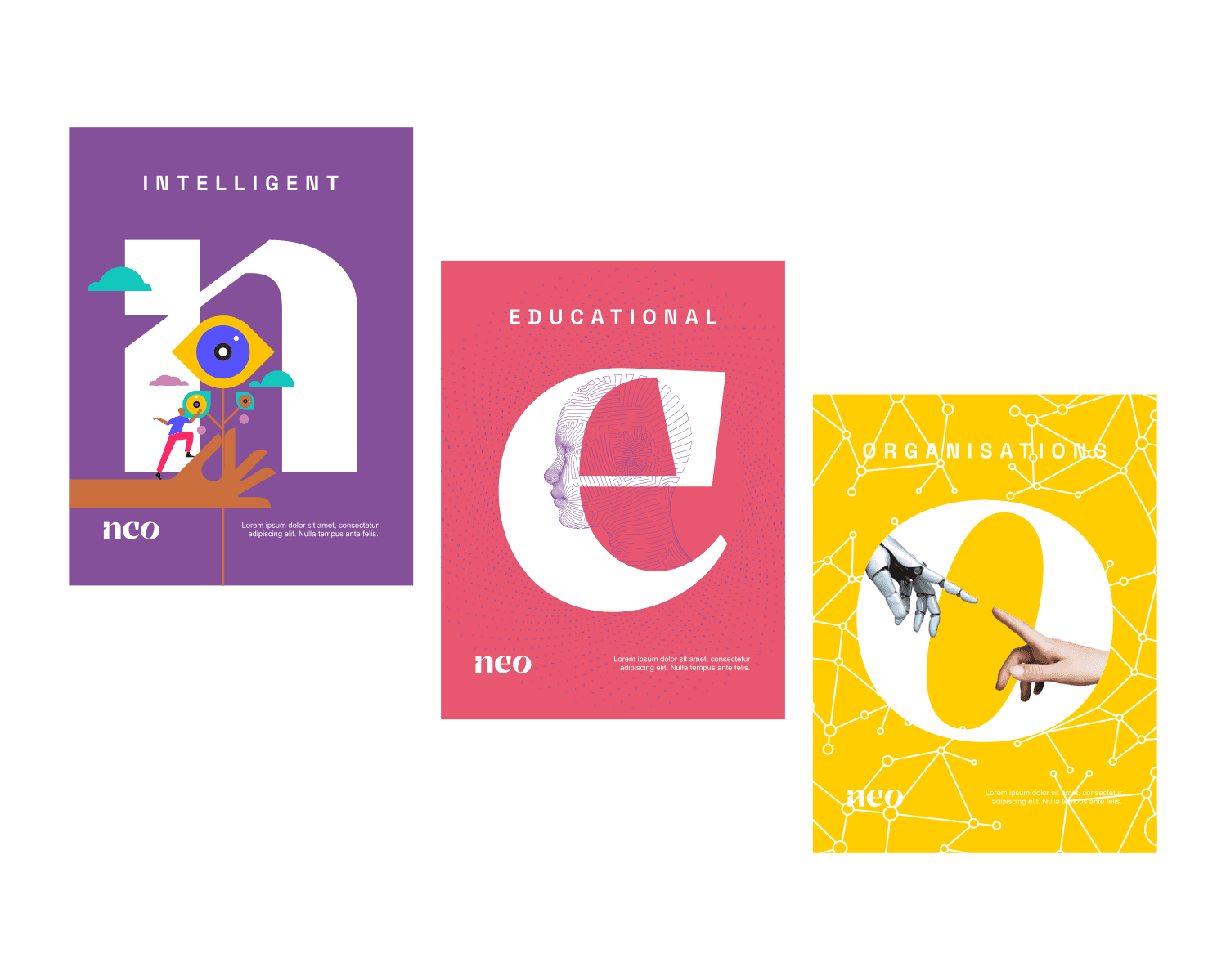
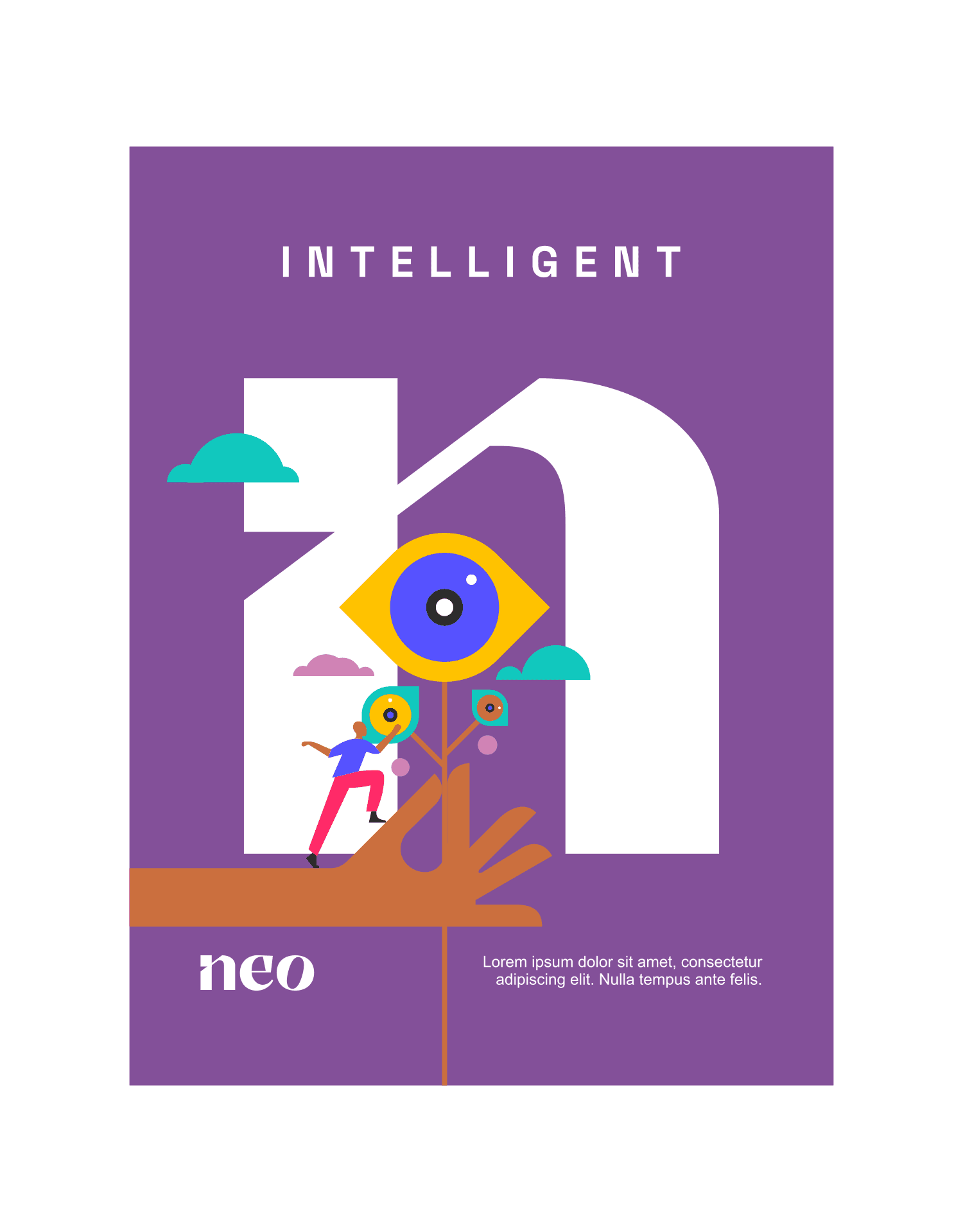
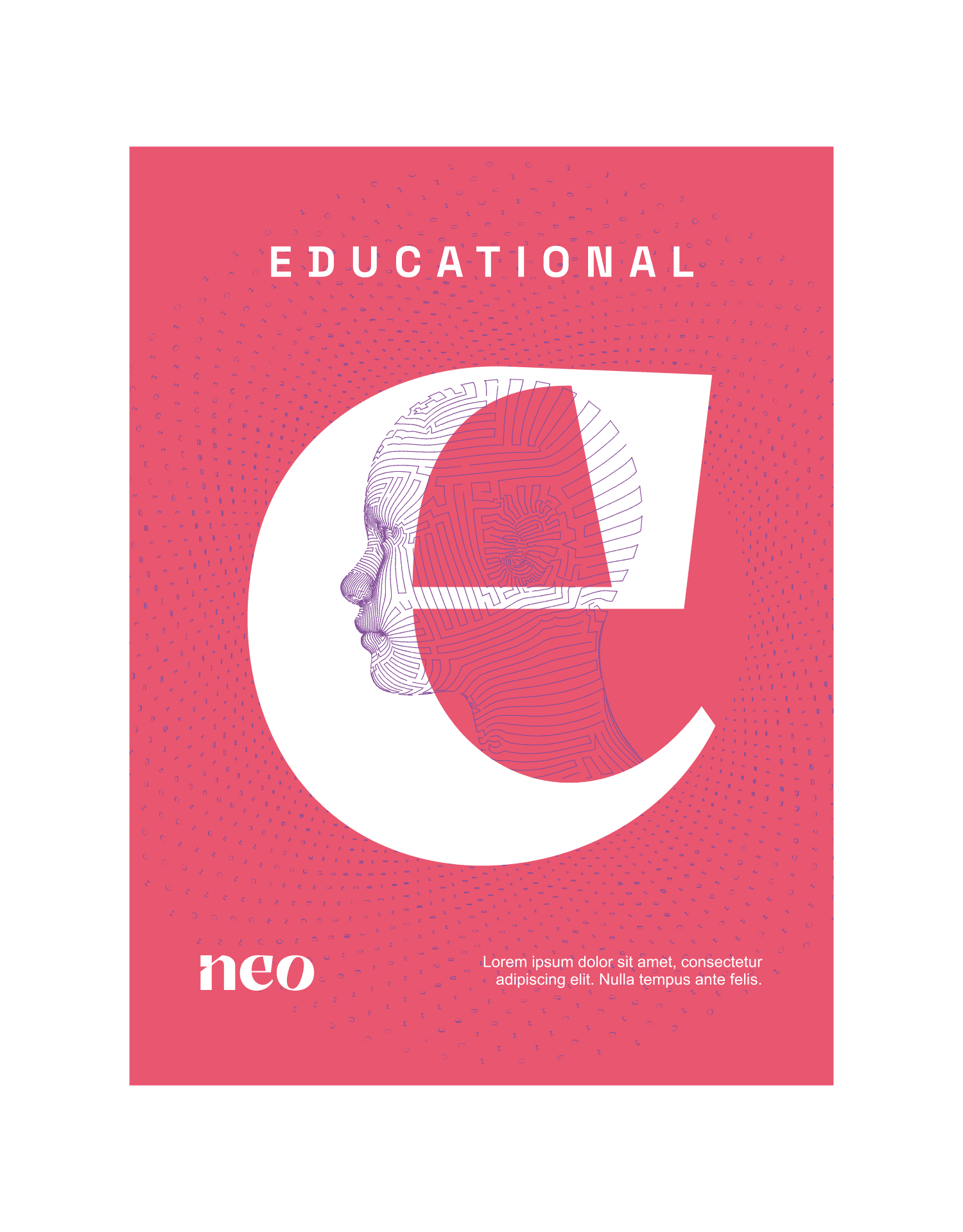
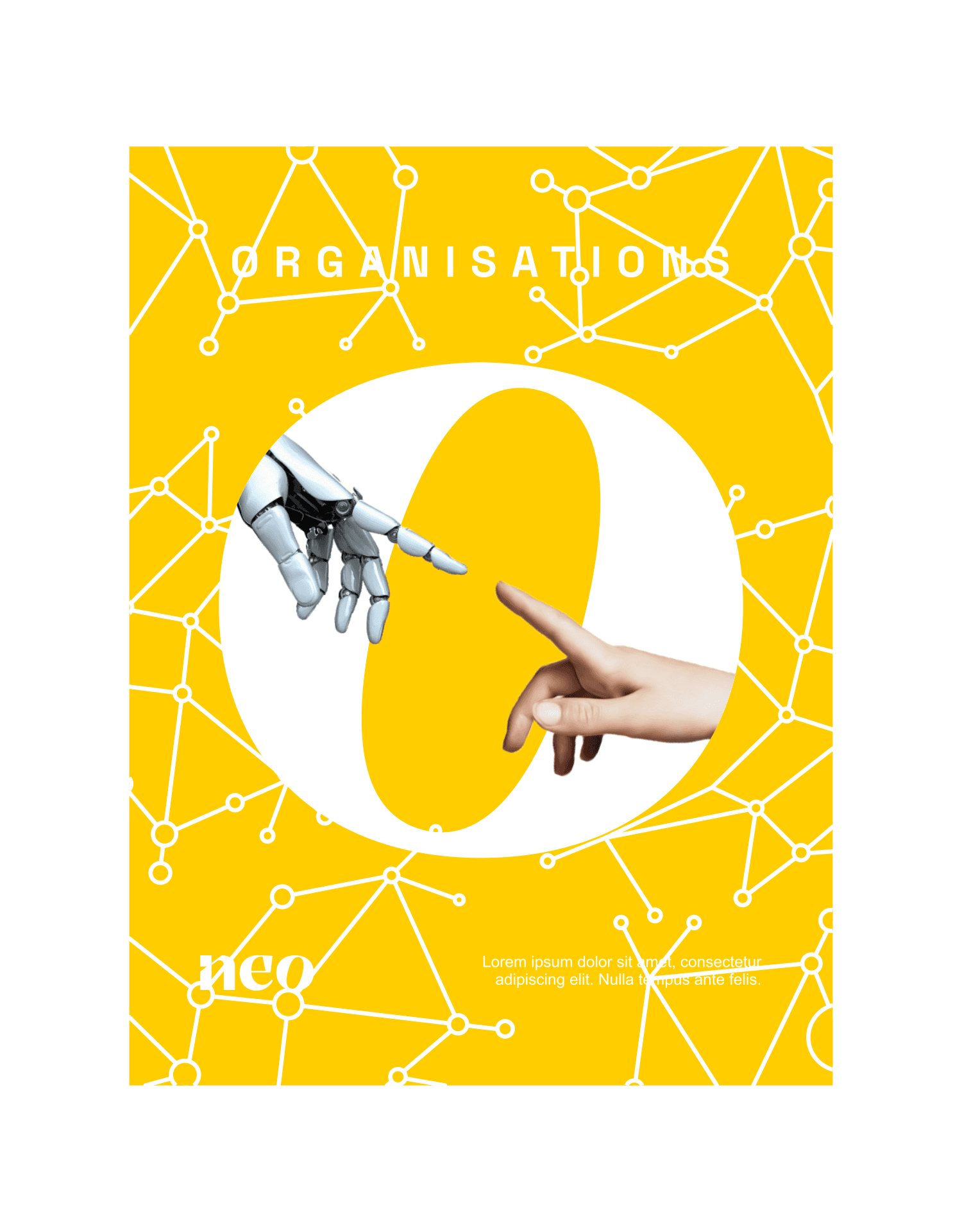
Extending the Vision
The final phase involved crafting three wall posters exploring design styles that complement and extend the brand identity. Each poster brings a unique visual approach while staying aligned with Neo's core look and feel.
Together, these elements create a cohesive, emotionally resonant brand presence that positions Neo as a trusted partner in educational transformation—connecting technology with the human experience of learning and growth.
Launch day
When the identity and design direction were unveiled to the entire company, the response was overwhelmingly positive. Both internal teams and the target audience embraced the new brand presence with enthusiasm, validating the strategic approach and thoughtful execution.
This successful launch established a strong foundation for Neo's journey ahead, creating not just a visual identity but a meaningful connection that will guide the brand's growth and evolution in the competitive EdTech landscape.


Project Reflection
Working on Neo provided an incredibly enriching experience that highlighted the fascinating dynamics within educational ecosystems. Collaborating closely with both institutional leadership and students revealed two distinctly different worlds - each with unique cultures, behaviors, tech comfort levels, and brand perceptions.
The interviews and discovery sessions with these contrasting audiences were both exciting and eye-opening, offering valuable insights into how the educational landscape has evolved over the years. Bridging these different perspectives to create a unified brand experience made this project particularly rewarding and memorable, reinforcing the importance of understanding diverse user needs and the power of thoughtful design to connect seemingly opposite audiences under one cohesive vision.